Simplifying procure-to-pay spend management.
Refreshing the Accrualify Experience
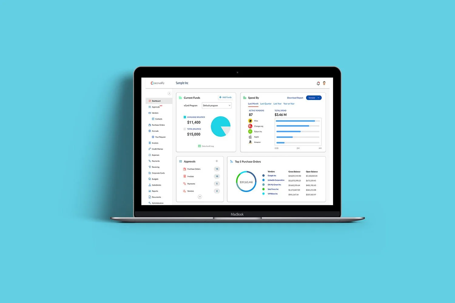
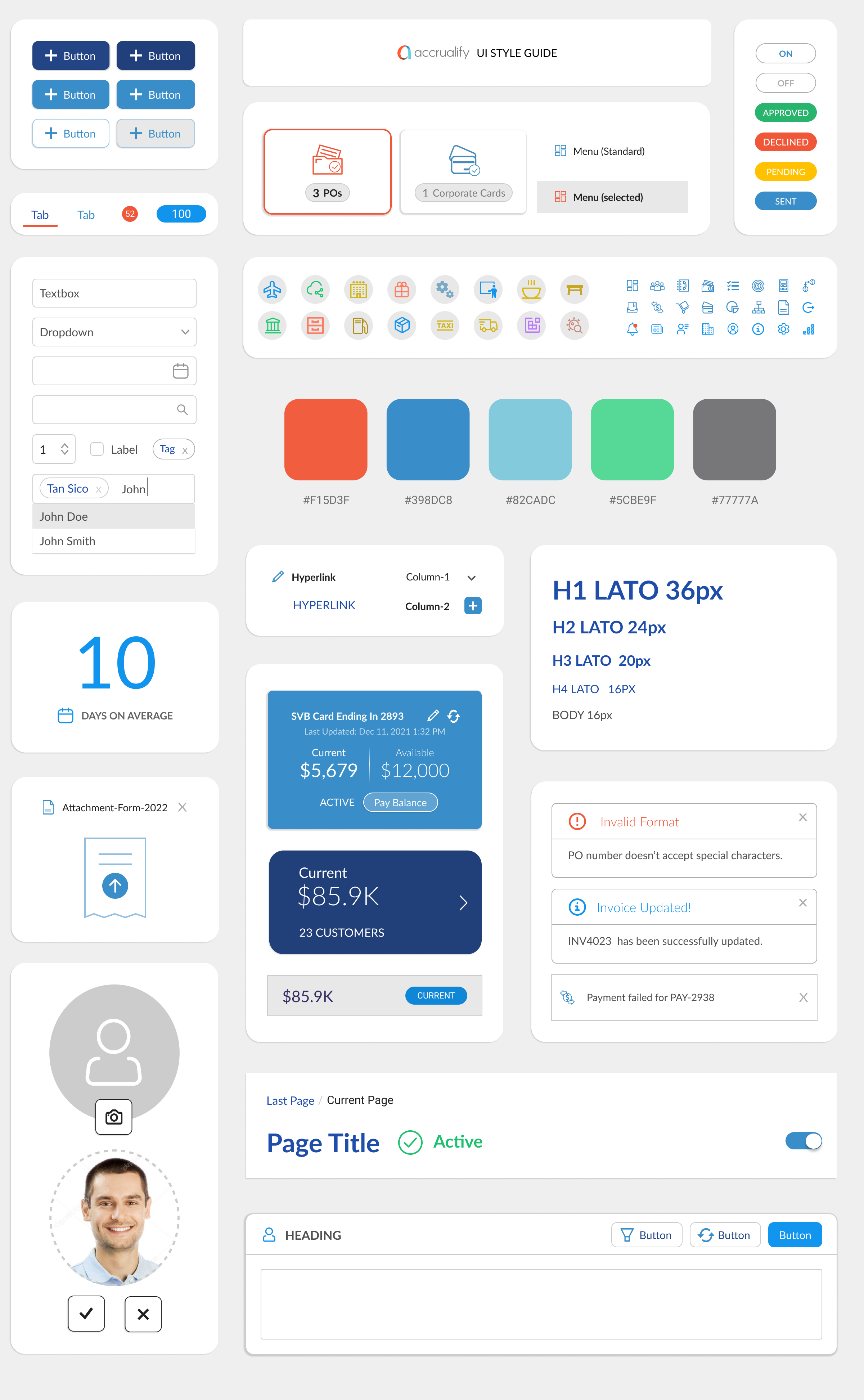
Accrualify helps mid-to-enterprise companies automate Procure-to-Pay and accounts payable. To modernize the platform without a full-scale redesign, we refreshed the web app with a new theme that streamlined UX and improved consistency. Working in agile two-week sprints, we built a scalable Figma design library, delivered key assets and screens, and collaborated closely with bizops and frontend teams across the US and India to align on priorities.
Key
Improvements
Style
Set a new default font and build a typography guide (Headings, Body, Navigation).
Expand the color palette and remove purple.
Use white as the base with vibrant UI accents.
UI
Softer rounded corners for panels, forms, and icons; improved use of space
Cleaner grids with icons replacing text, simplified row highlights, and a functional column editor
Fixed non-working scrollbars for smoother navigation
UX
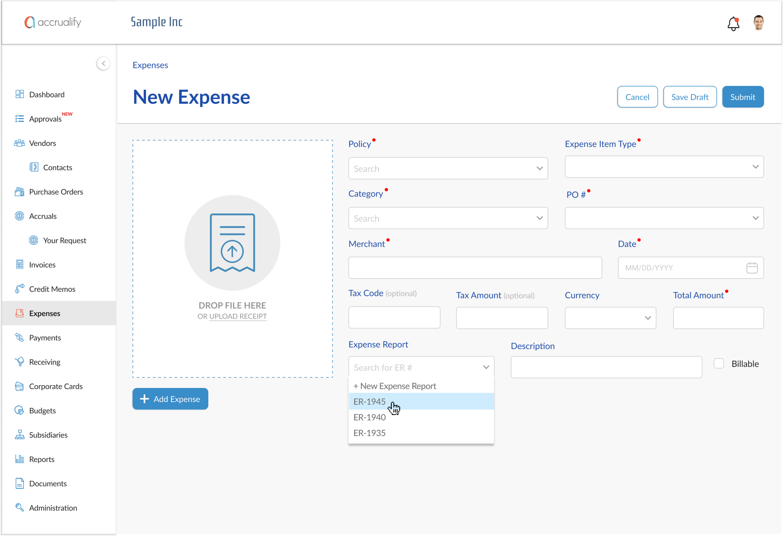
Simplify side navigation by merging “Approvals” into one page; add tabs in company settings for easier navigation.
Create a consistent blueprint for primary buttons across sectional and detail pages.
Fix inconsistencies by removing broken links, redundant buttons, and poorly designed forms; address NOLT recommendations.
Mobile App 2.0
The bizops team’s key initiative was redesigning the outdated mobile app to deliver a modern, efficient experience connected to web workflows. Employees could now snap receipts to create expenses, while managers approved POs, invoices, or virtual cards directly from mobile.
Research
Accrualify’s competitors like Expensify and TripActions excel with cleaner UX and simpler information architecture, while Accrualify remains more feature-rich but felt outdated. Our goal: modernize design, streamline flows, reduce cognitive load with visuals, and add personalized financial insights.
Taskflows for Mobile App 2.0
Key Improvements in the New Design
Redesigned mobile app for modern, seamless experience
Snap receipts to create expenses
Approve POs, invoices, or vCards on mobile
Alerts
Users’ top request was a central in-app notification system to reduce email reliance. We introduced a bell menu with three tabs: Notifications (approvals, payments, receipts), Messages (invoice/PO updates), and News (blogs, releases).
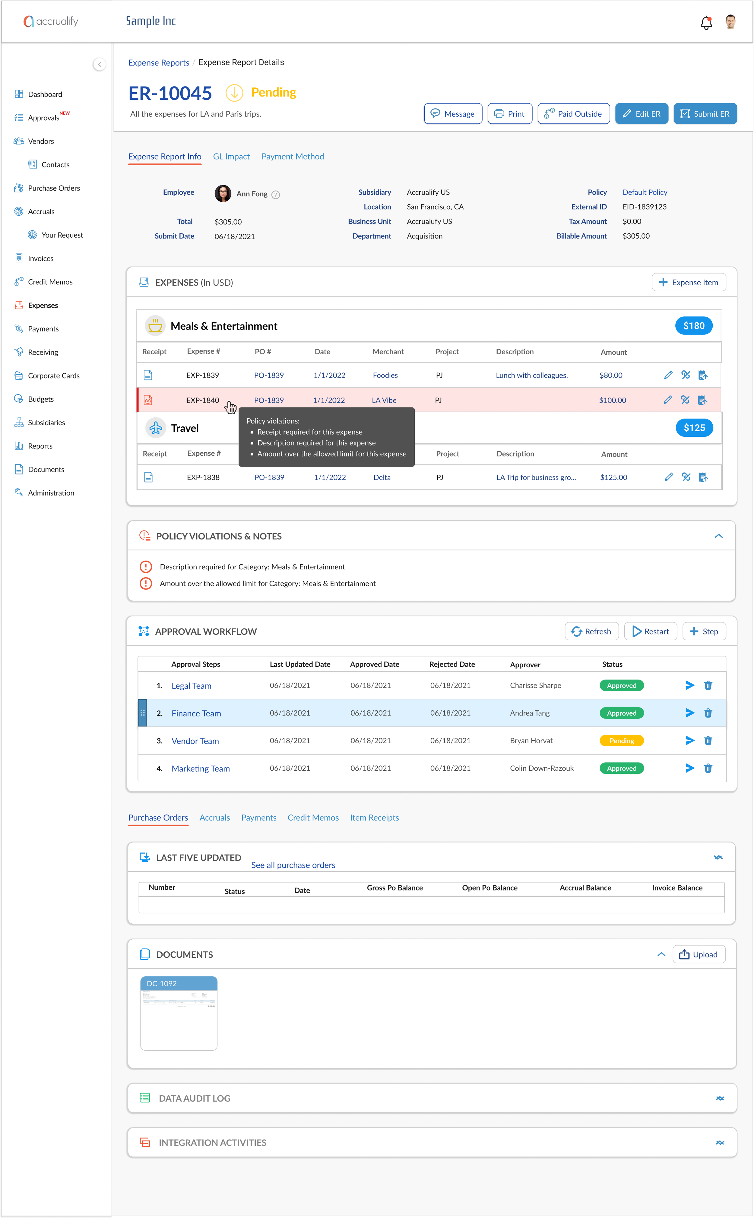
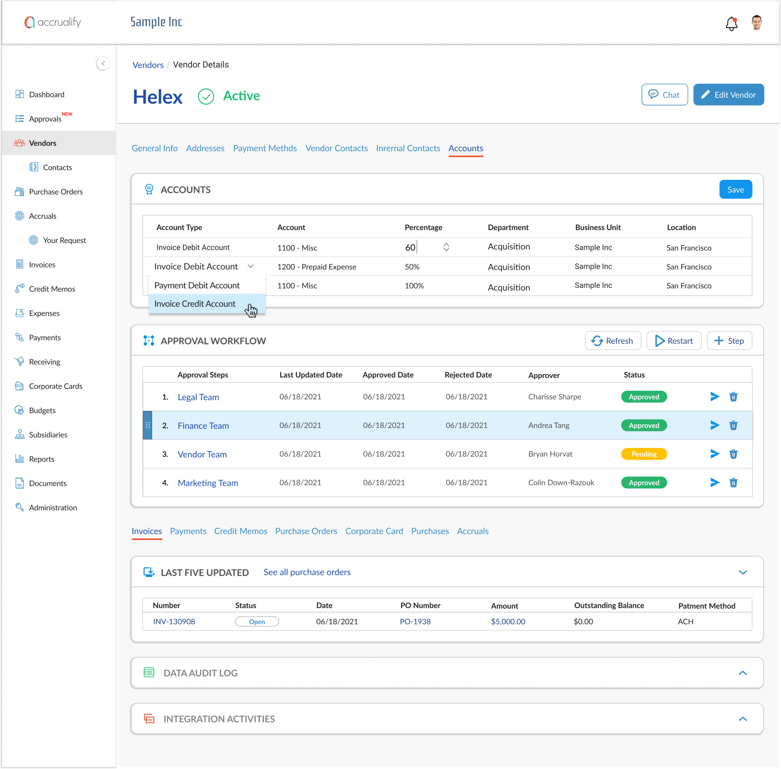
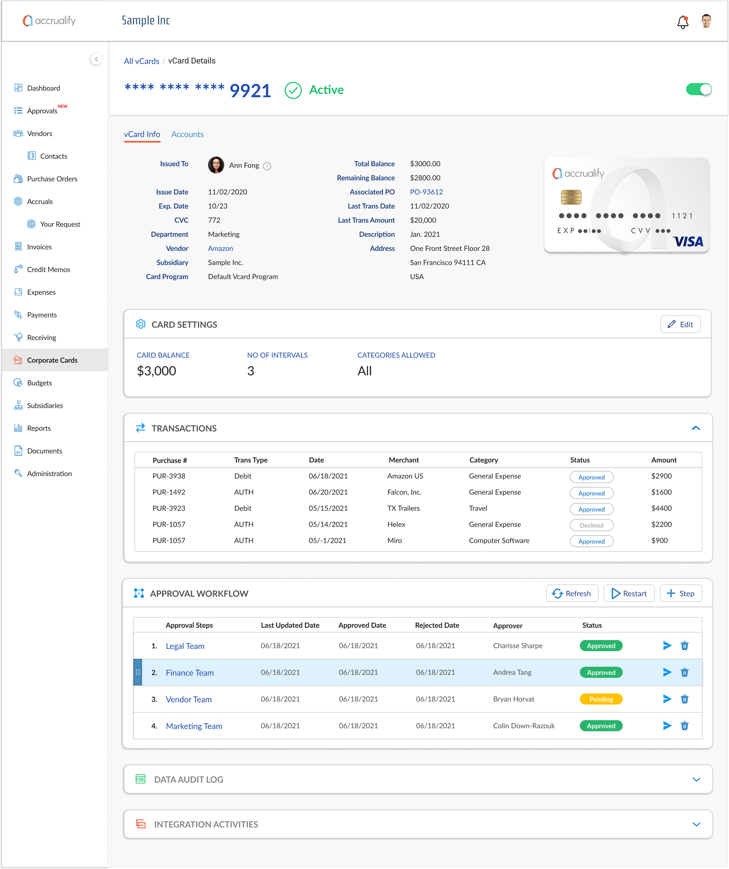
Approval Workflow
The BizOps team set out to reimagine approval workflows in Accrualify. Our design goal was to make the panel intuitive, enabling users to build complex workflows with steps and triggers, while supporting easy drag-and-drop reordering.
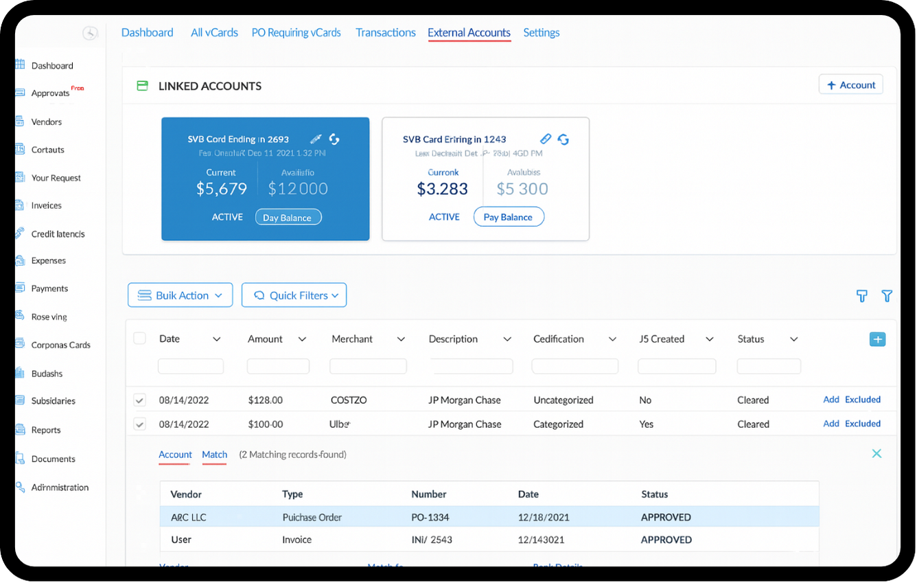
External Accounts
As Accrualify’s customer base grew, we introduced a key feature to make the platform a one-stop shop for expense reimbursement. Users can now connect external bank accounts, import transactions, and either create new expenses or match them to existing invoices and purchase orders.